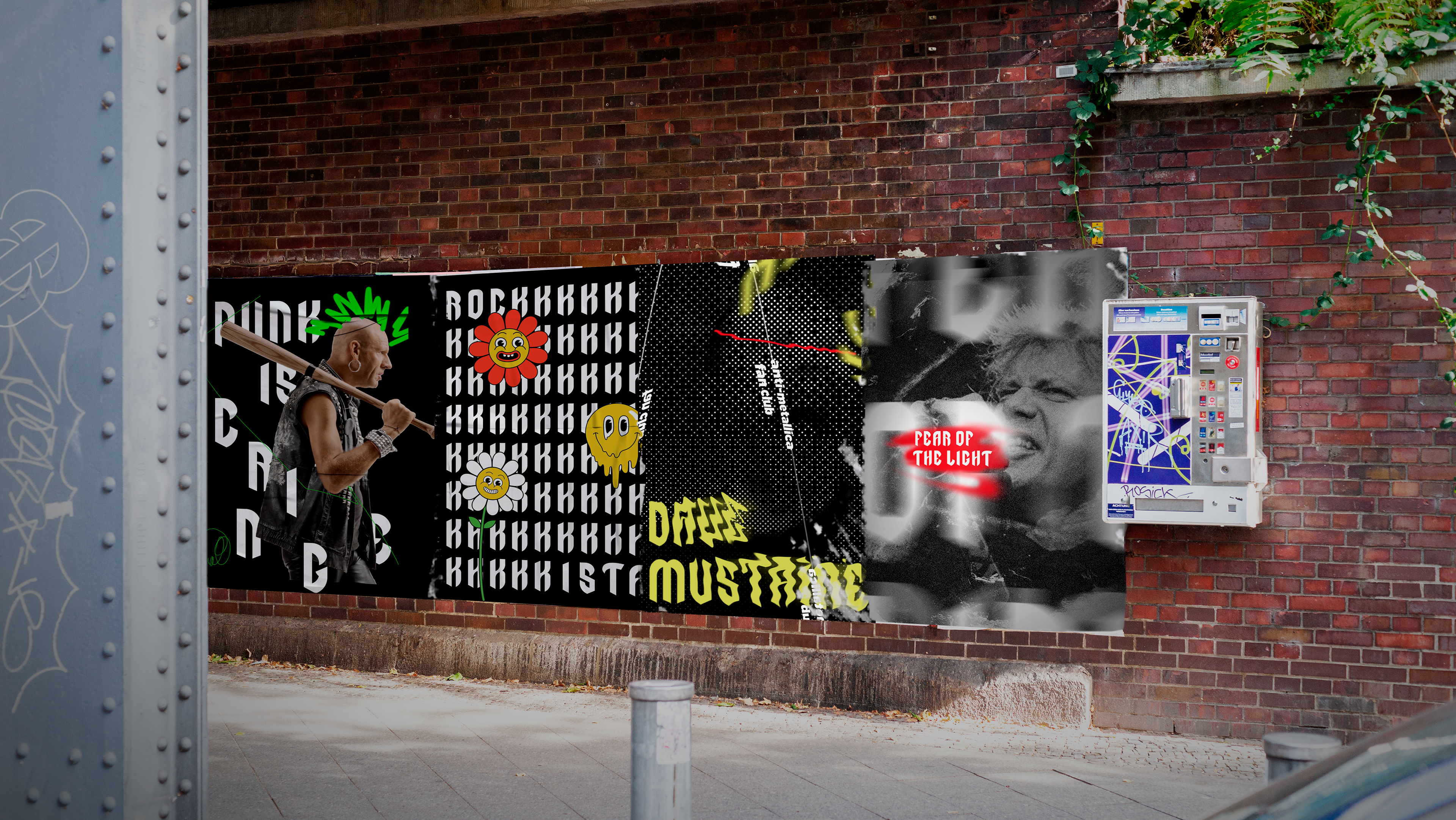
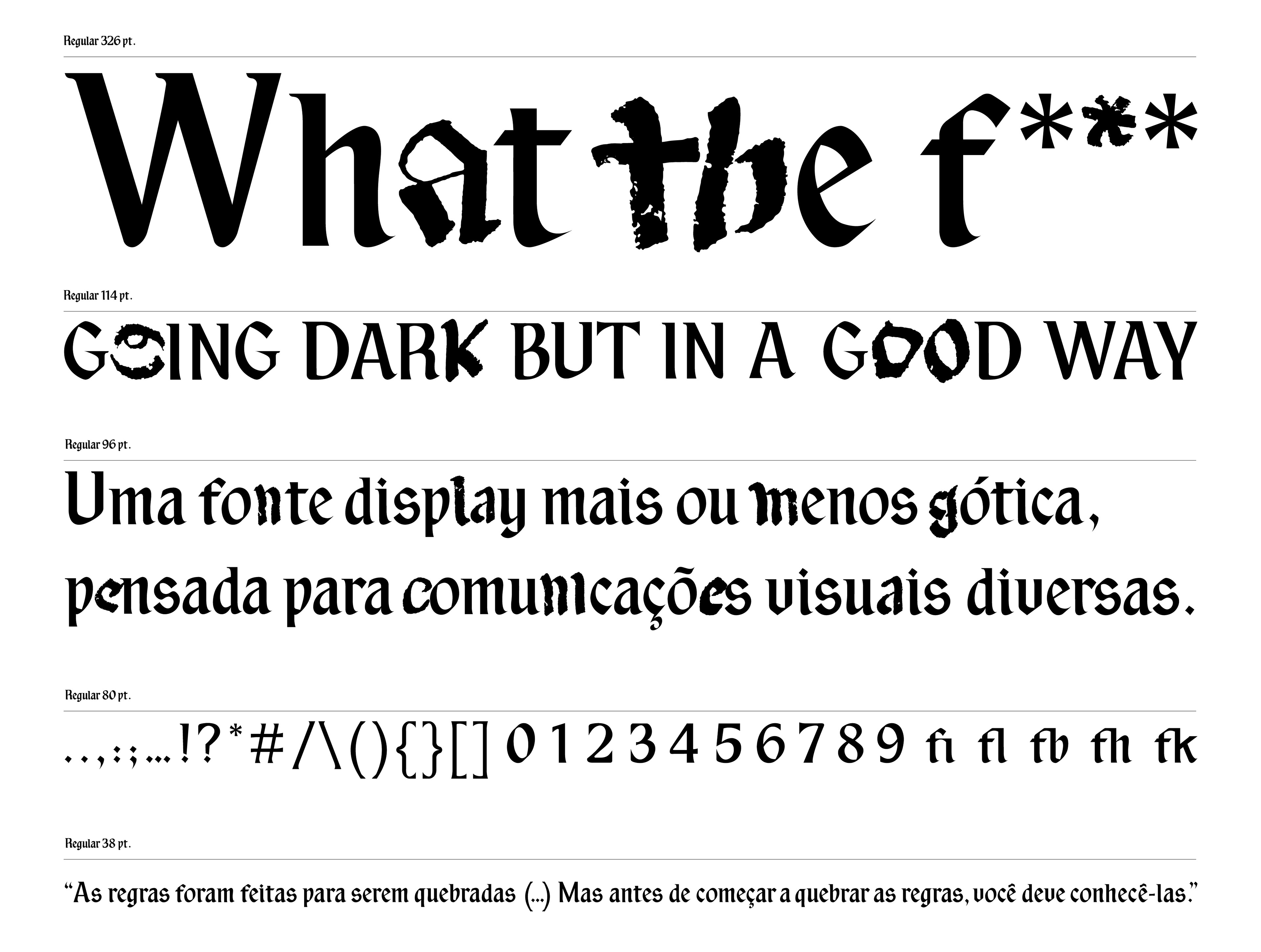
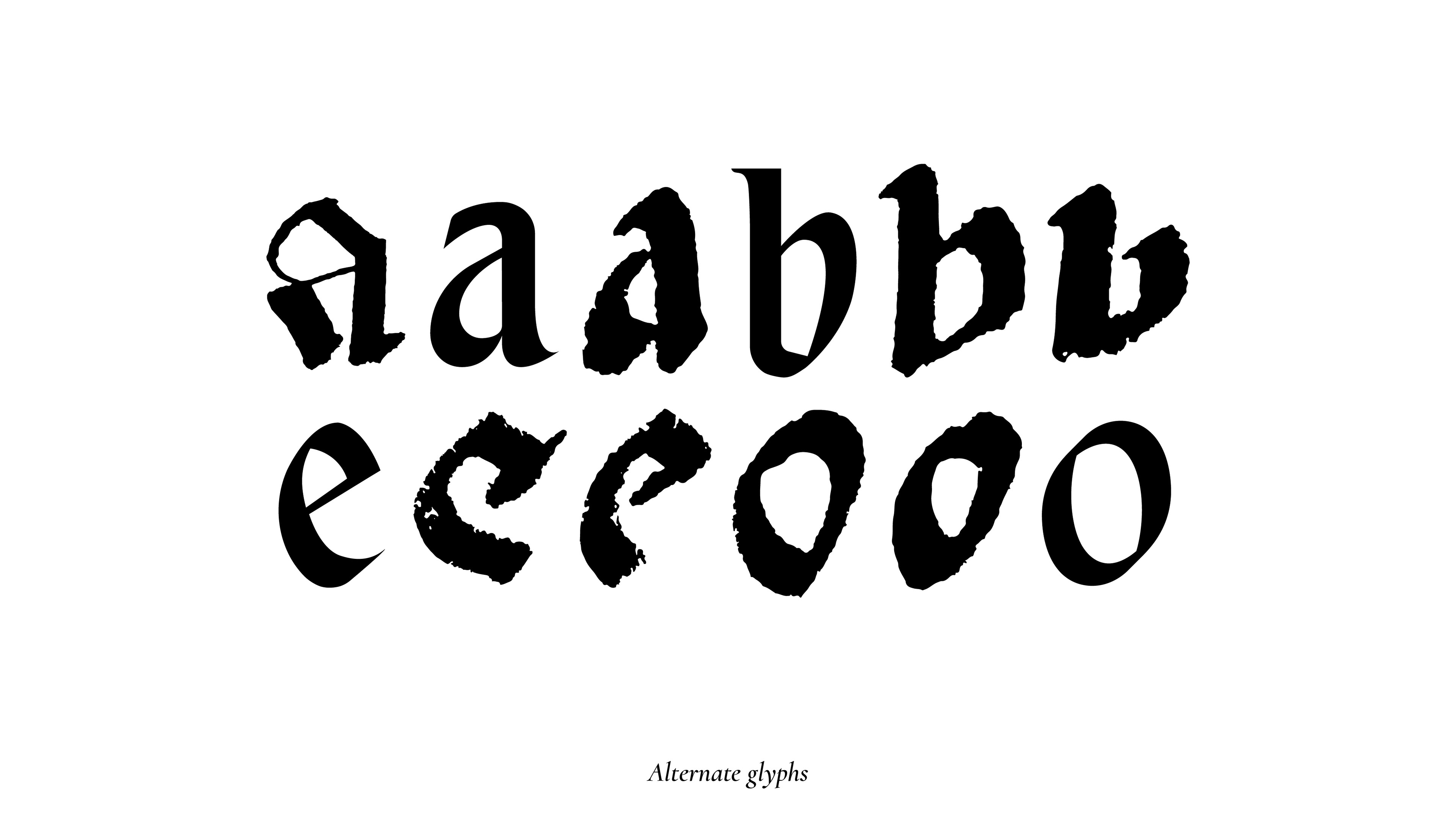
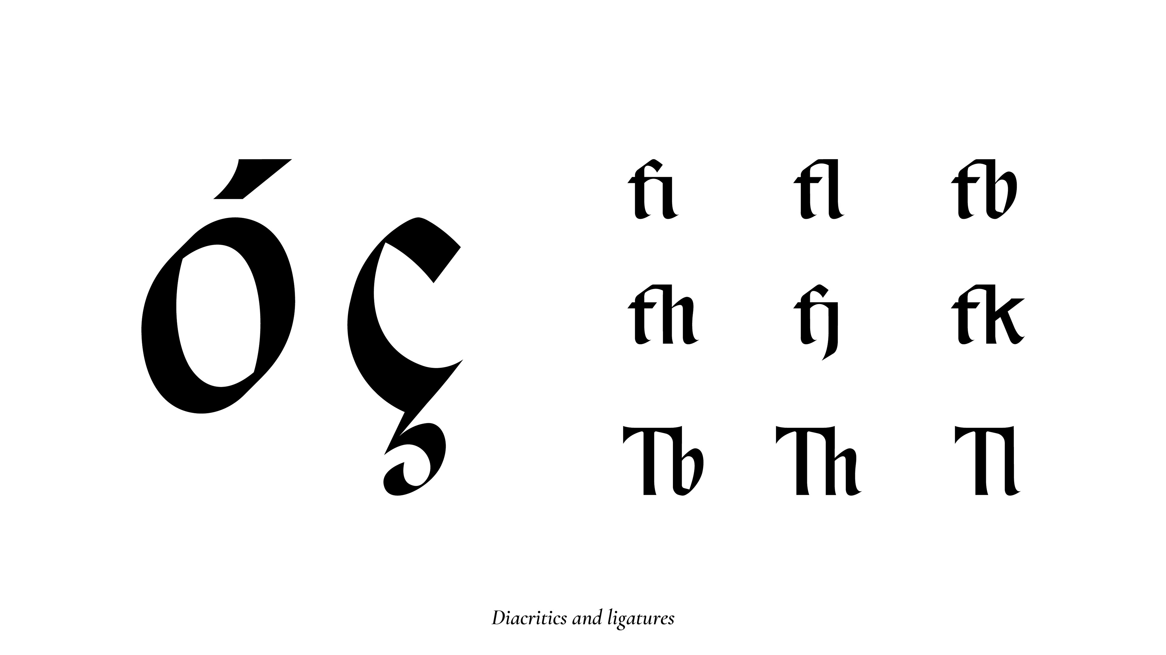
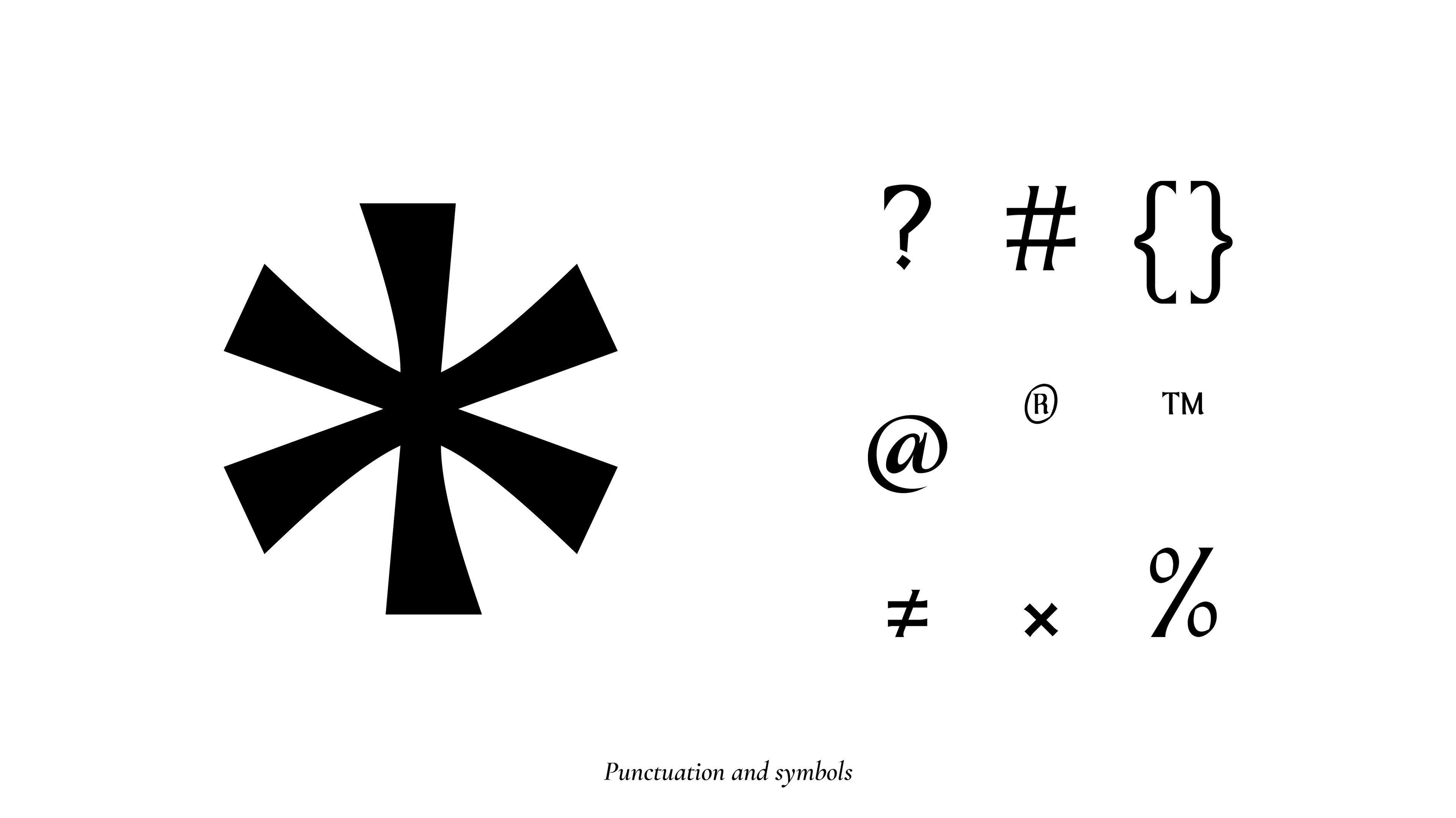
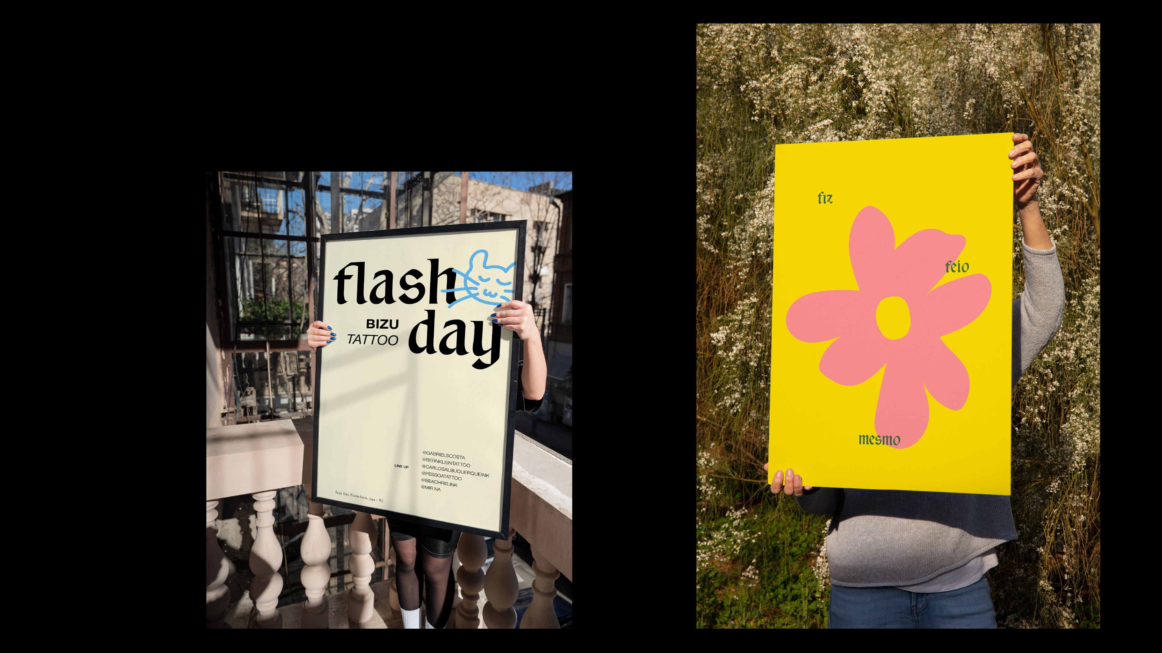
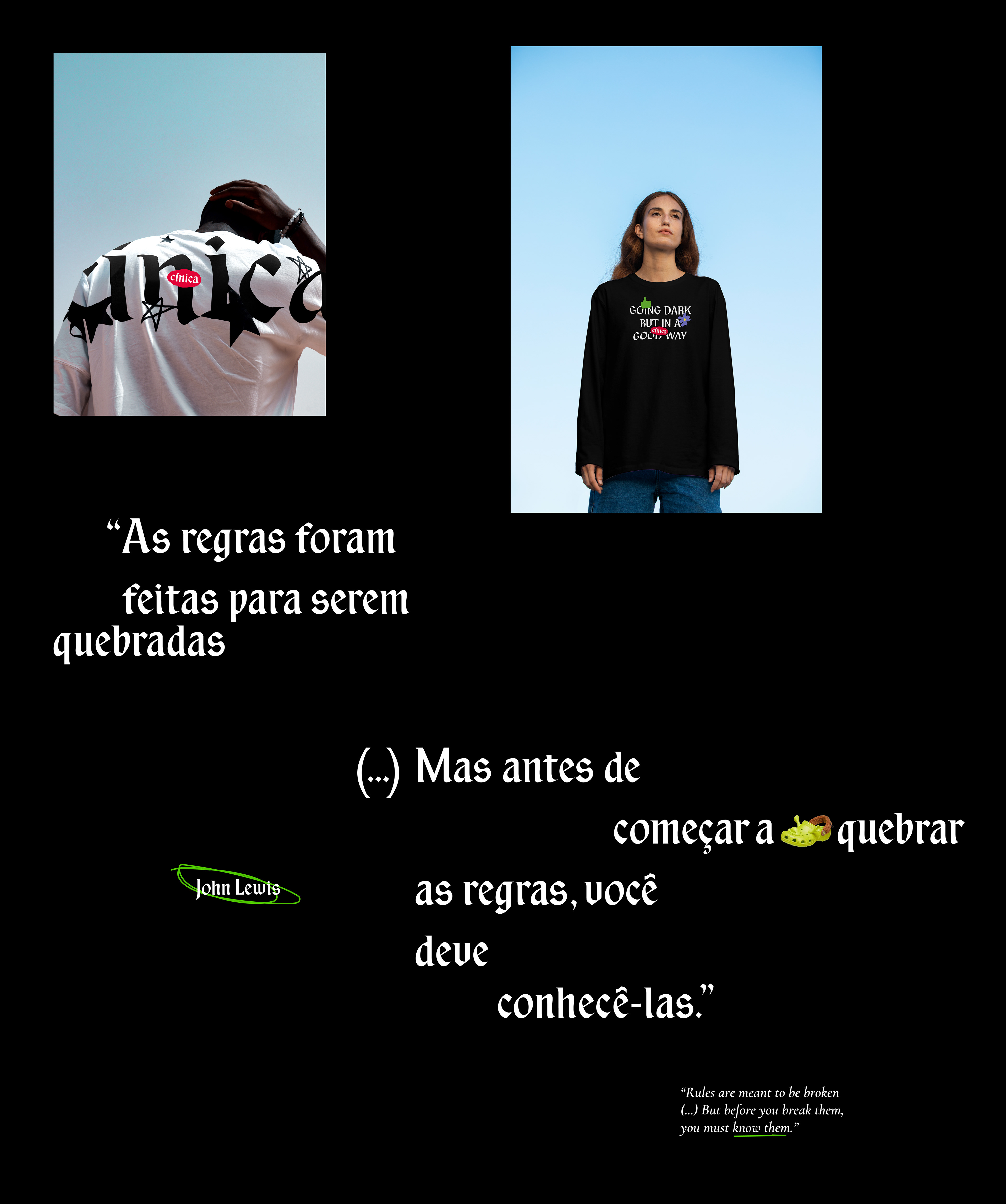
CÍNICA É UMA TIPOGRAFIA E UMA SÉRIE GRÁFICA EXPERIMENTAL QUE DESAFIA A FUNCIONALIDADE E A EXPRESSIVIDADE DA LETRA GÓTICA (ALÉM DE SER MEU TCC).
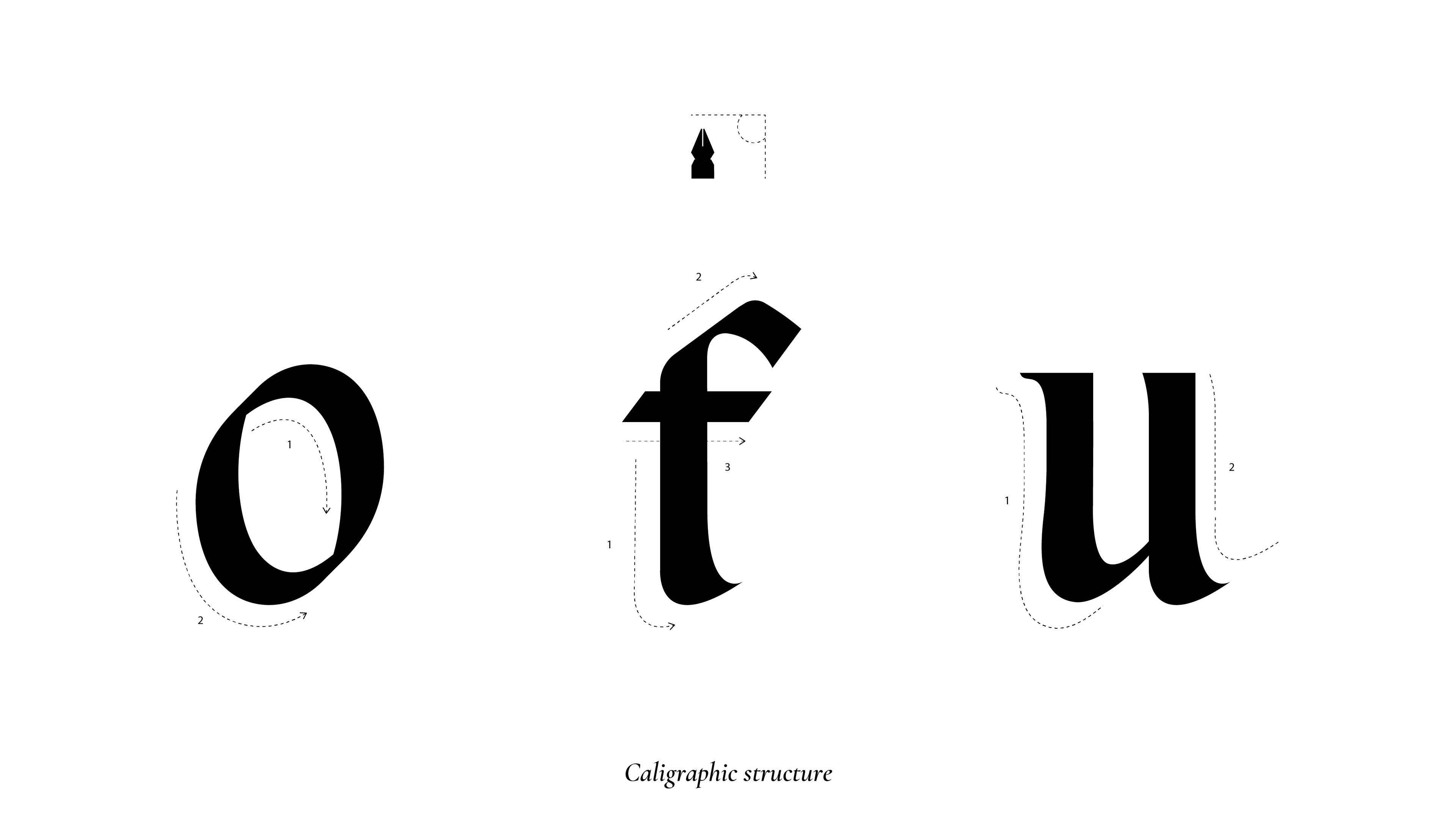
Desenvolvida como uma fonte híbrida, foi criada a partir da caligrafia gótica e adaptada com traços das letras romanas, enquanto as aplicações funcionam como peças provocativas, irônicas e de grande impacto visual. Para enfrentar a ausência e os estereótipos associados às letras góticas na comunicação visual contemporânea, Cínica é uma tentativa debochada de gerar novas possibilidades para o estilo e promover uma reflexão sobre a originalidade e a inovação no design gráfico e tipográfico.
CÍNICA IS AN EXPERIMENTAL TYPEFACE AND GRAPHIC SERIES THAT CHALLENGES THE FUNCTIONALITY AND EXPRESSIVENESS OF GOTHIC LETTERING (AND IT’S ALSO MY UNDERGRADUATE THESIS).
Developed as a hybrid font, it was created by combining gothic calligraphy with elements of Roman letters. Its applications function as provocative, ironic, and visually impactful pieces. To address the absence and stereotypes associated with gothic lettering in contemporary visual communication, "Cínica" is a playful attempt to generate new possibilities for the style and to promote reflection on originality and innovation in graphic and typographic design.
PRÊMIOS E RECONHECIMENTOS
AWARDS AND RECOGNITION
AWARDS AND RECOGNITION
LADAWARDS 2025 — Estudante/Tipografia
LADAWARDS 2025 — Student/Typography
BDA 2025 — Estudante/Design gráfico
BDA 2025 — Student/Graphic design
LADAWARDS 2025 — Student/Typography
BDA 2025 — Estudante/Design gráfico
BDA 2025 — Student/Graphic design


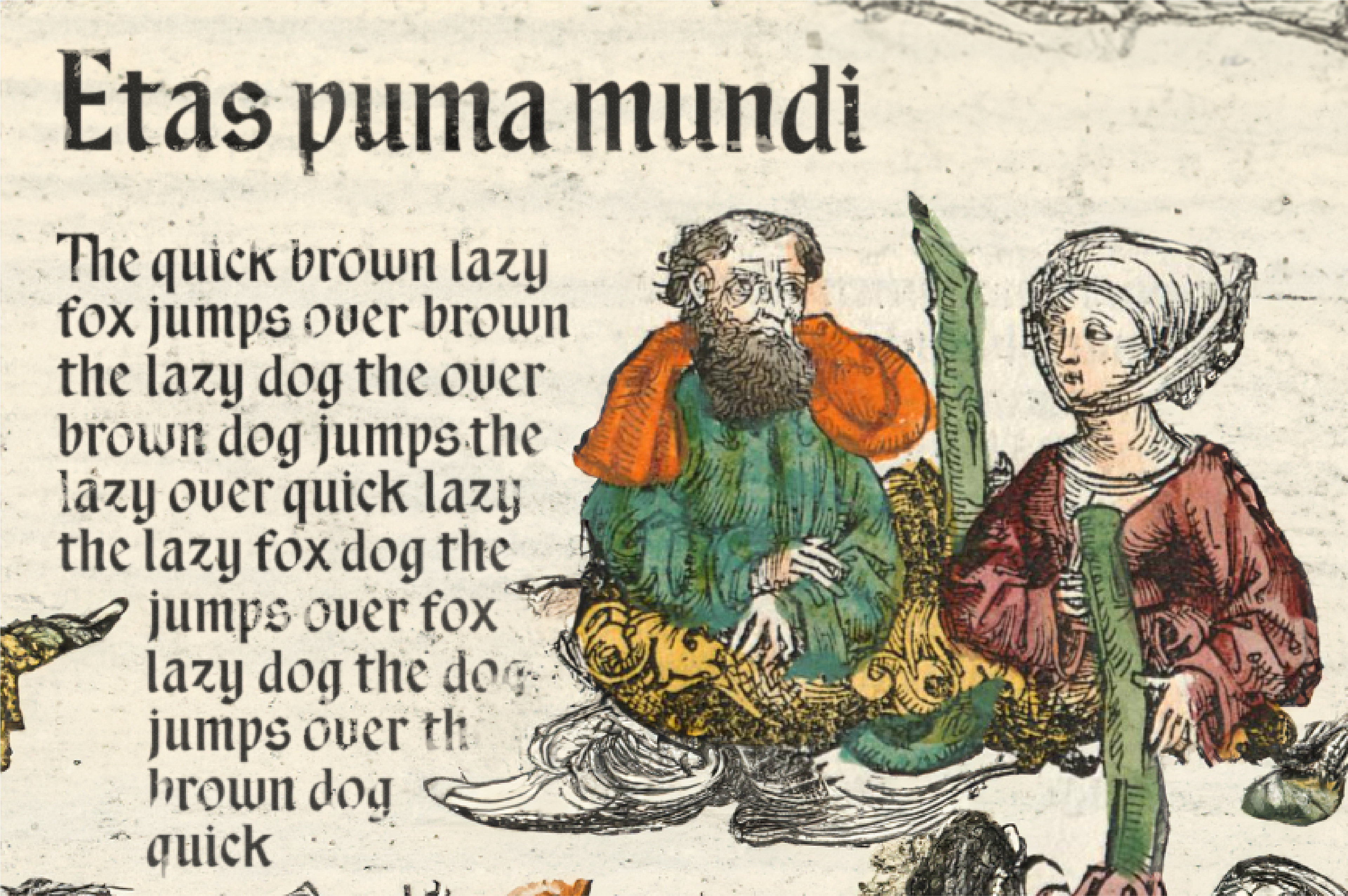
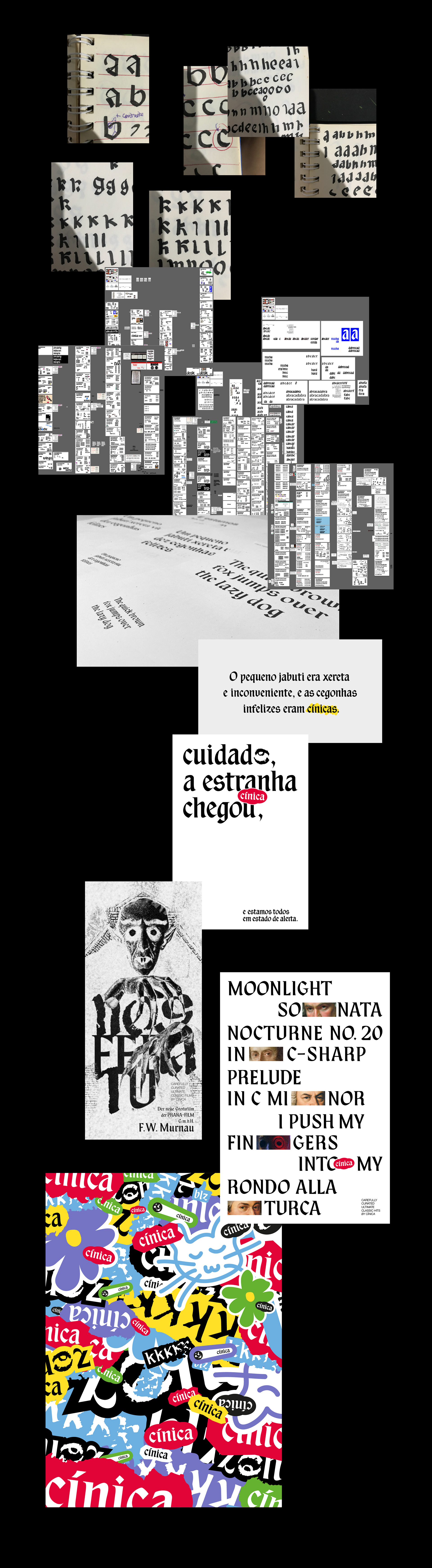
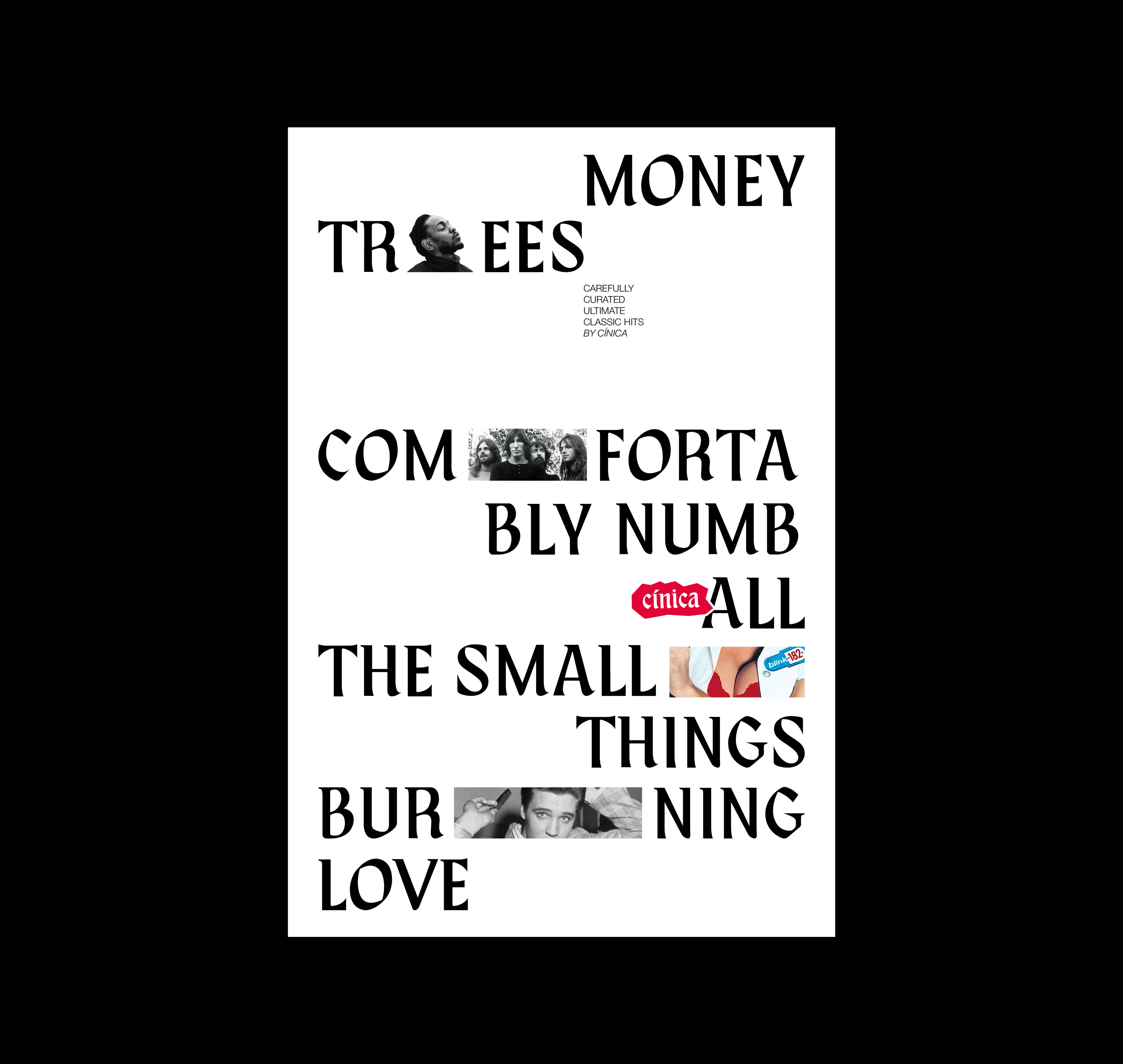
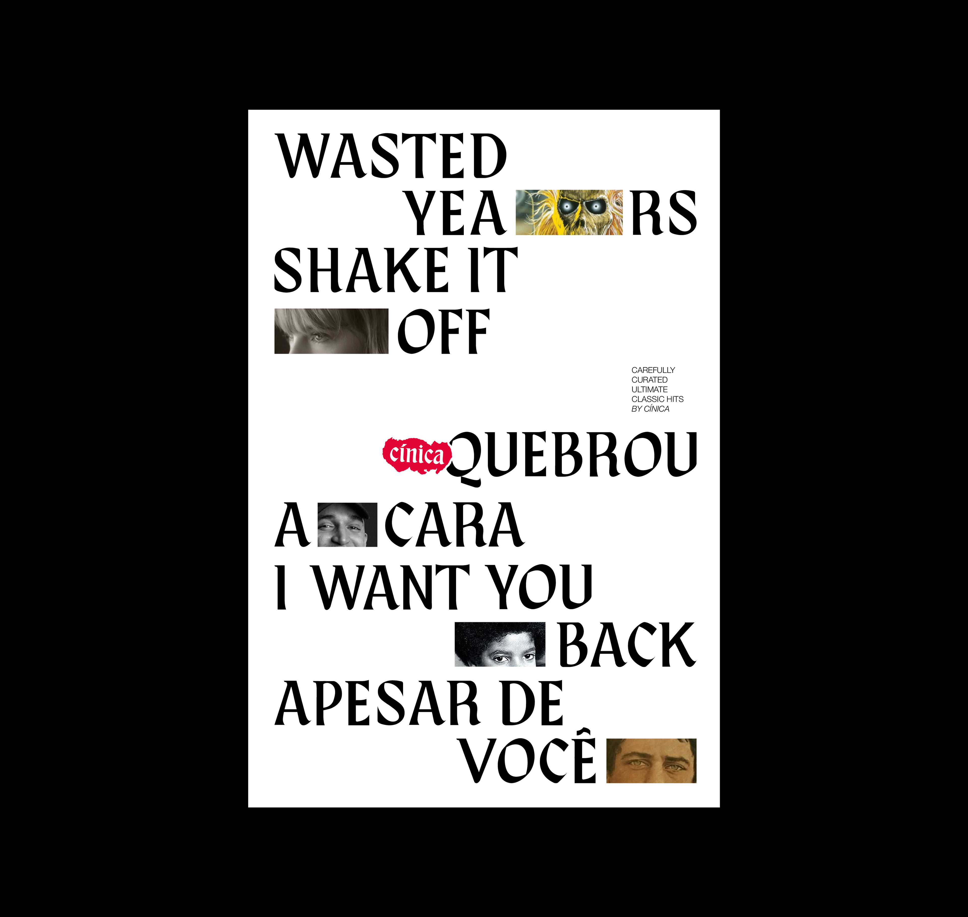
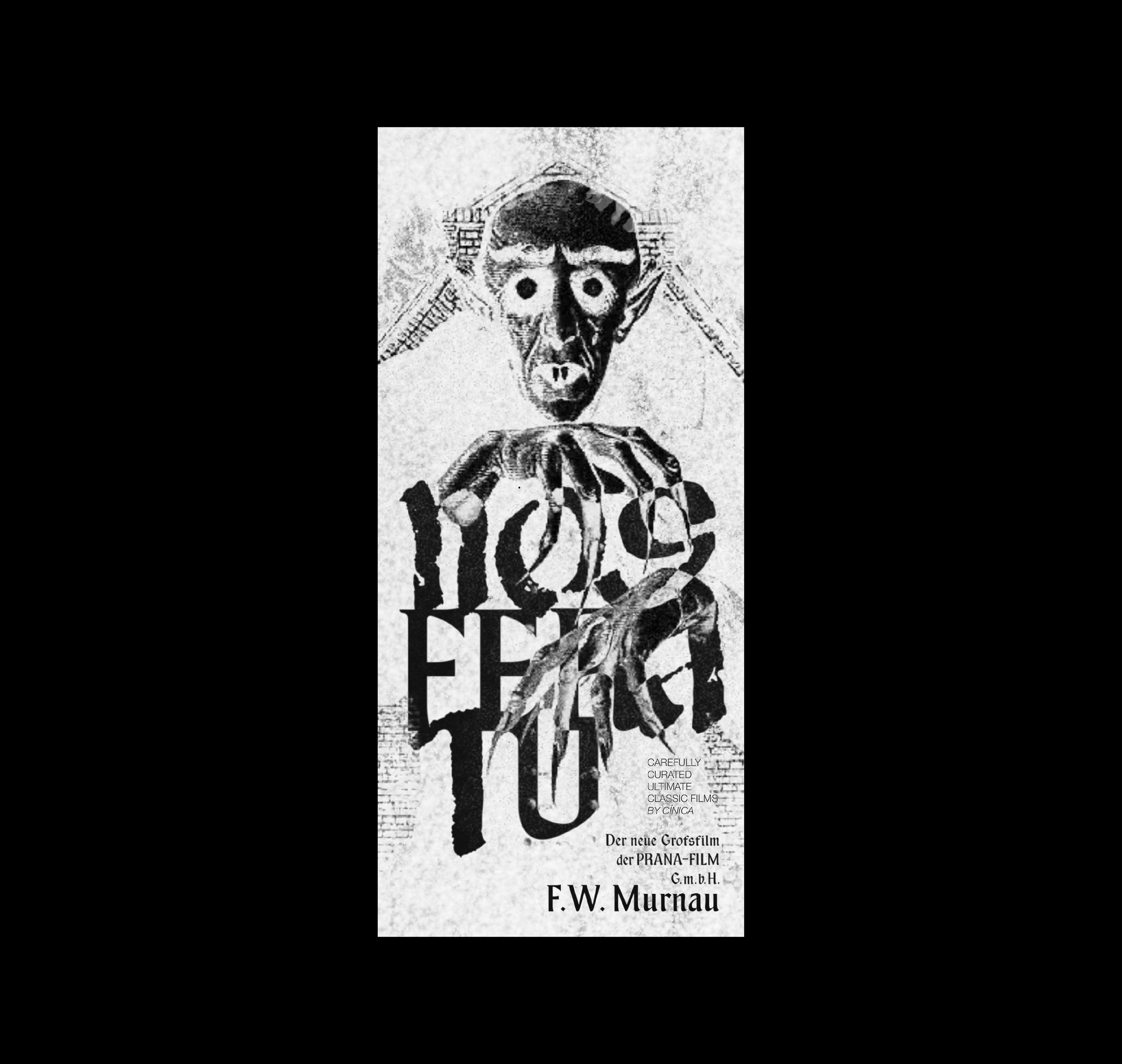
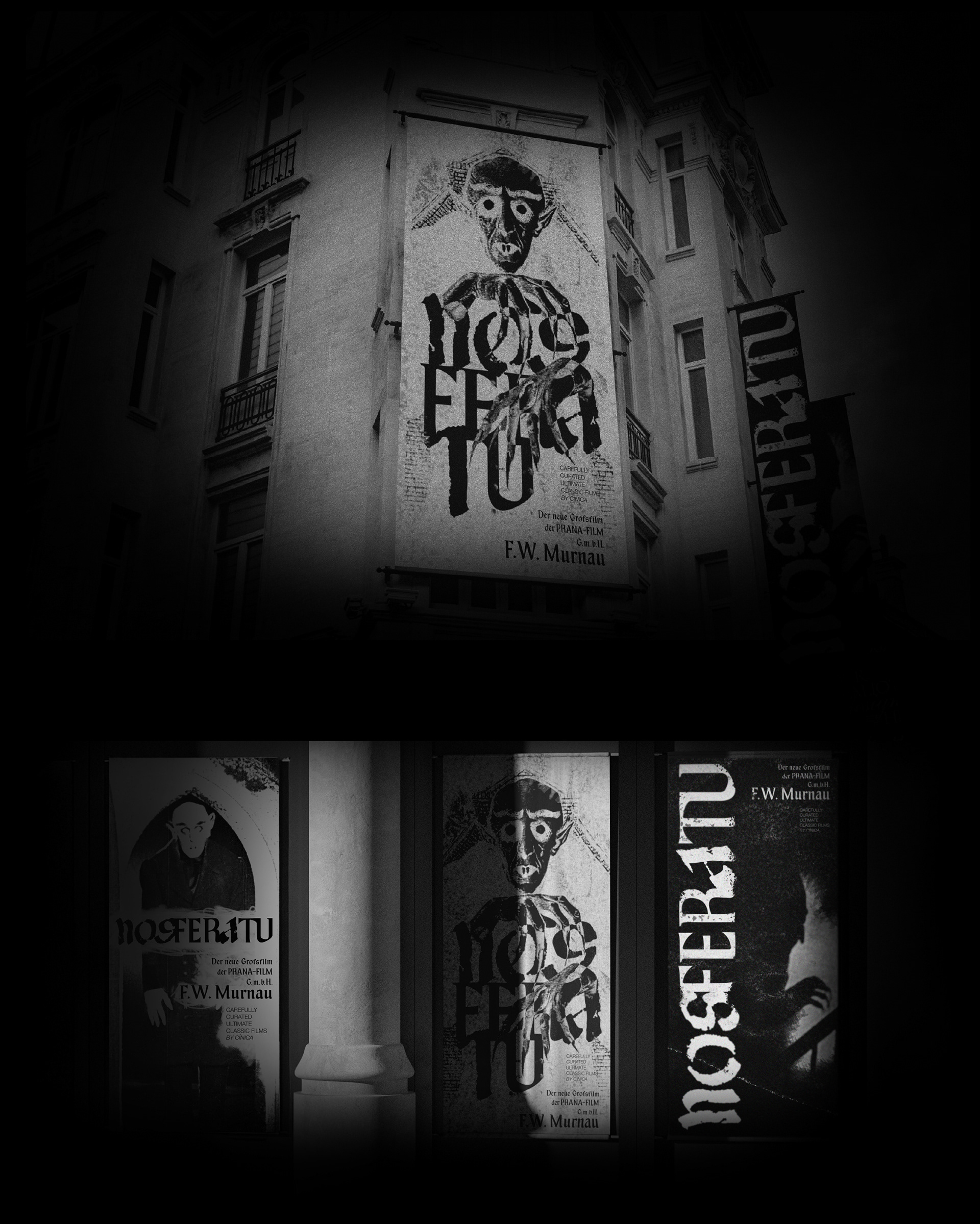
UMA TENTATIVA DE TRANSFORMAR UM ESTILO HISTORICAMENTE ESTIGMATIZADO EM UMA FERRAMENTA CRIATIVA CONTEMPORÂNEA.
A construção tipográfica híbrida, escolha de cores vibrantes, diagramação não convencional e ilustrações inusitadas, foram fundamentais para desassociar a fonte de certos estereótipos que envolvem a letra gótica. Além disso, o projeto partiu da pesquisa de referências bibliográficas e iconográficas, seguida de um processo criativo baseado na experimentação.
AN ATTEMPT TO TRANSFORM A HISTORICALLY STIGMATIZED STYLE INTO A CONTEMPORARY CREATIVE TOOL.
The hybrid typographic construction, the choice of vibrant colors, unconventional layouts, and unusual illustrations were fundamental in dissociating the typeface from certain stereotypes surrounding Gothic lettering. In addition, the creative process was based on research of bibliographic and iconographic references, followed by an experimental approach to design.
AUTOR
Leonardo Knust
ORIENTAÇÃO
Julie Pires
BANCA
Julie Pires
Nair de Paula Soares
Pedro Lomba
AGRADECIMENTOS
André Electo
Fernanda Salgado
Fabio Haag
Guilherme Tavares
Leonardo Knust
ORIENTAÇÃO
Julie Pires
BANCA
Julie Pires
Nair de Paula Soares
Pedro Lomba
AGRADECIMENTOS
André Electo
Fernanda Salgado
Fabio Haag
Guilherme Tavares